Election Fundamentals
As we get closer to the November election, pundits and other analysts will be spending a lot of time identifying “swing states” and “battlegrounds” that will be key to winning the White House. From the reporting, one could get the impression that campaigning is like a chess match. Each campaign makes strategic decisions about where to allocate their resources, and the one that can identify the right set of states and persuade key segments of the electorate will come off victorious.
This particular narrative seems to go out of its way to highlight the differences between elections. However, recent years have seen more continuity than change. In this blog post, I present several different ways of visualizing this increasing sameness from one election to the next.
One simple way to visualize the relationship between two elections is to look at the rankings of the states from one election and compare them with those in another. (Throughout this post, when I refer to rankings, I am talking about the rankings of the states in terms of the proportion of the two-party vote that went to the Republican candidate.) If campaigns are able to significantly change the rankings of the states by their efforts, then it might make sense to talk about elections in terms of “swing states” and “battlegrounds.” On the other hand if the rankings from one election do not change much, it is difficult to argue that the campaigns are having much of an effect on the underlying dynamics of the race. They might still do well to concentrate their limited resources on marginal states (if the race is going to be close, every electoral vote counts), but we would expect to see some change in the rankings of the states that corresponded to where the campaigns were focusing their attention.
The figure below shows a scatter plot with the ranking of the states in the 2004 election on the horizontal axis compared against the rankings of the states in the 2008 election on the vertical axis. States that fall into the upper right part of the graph (Wyoming, Utah, Oklahoma, Idaho) were top ranked for the Republican candidate. Those that fall into the lower left part of the graph (DC, Vermont, Rhode Island, Massachusetts) were bottom ranked for the Republican (and, since both 2004 and 2008 were two-men races, top ranked for the Democrat). If any state had fallen into the upper left hand part of the graph, it would mean it was top ranked for the Republican in 2008 but not in 2004. The closest we get to a state like that in this figure is Arkansas. Arkansas received a much higher ranking for McCain in 2008 than we might expect given its relatively middling ranking in 2004.
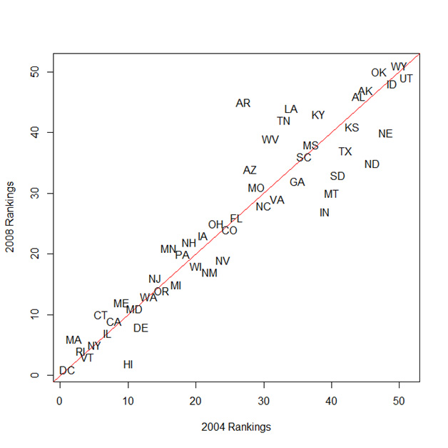
If there were no change in the rankings of the states from 2004 to 2008, they would all line up on the diagonal red line running through the center of the figure. As we can see, there was not much movement in terms of the relative rankings of the states between 2004 and 2008. Most of the points fall on or very near the diagonal line. This is somewhat surprising given the dramatically different outcomes of the 2004 and 2008 elections.
The figure below shows a similar plot. Here, instead of the rankings of the states, I plot the actual proportion of the two-party vote that went to the Republican candidate in each election. Again, the red line shows where states would fall if the proportion of the two-party vote was the same from 2004 to 2008 (the results in MA, WV, TN, and OK, for example, did not change much between 2004 and 2008).
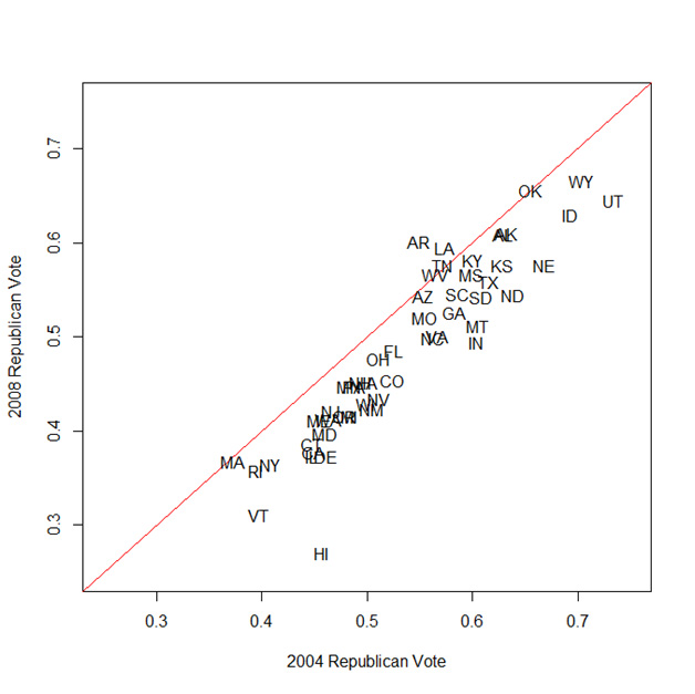
When we look at the proportion of the vote, we can see that Obama’s victory in 2008 was not due solely to a brilliant strategy whereby he moved the vote in a few key swing states. His vote share increased (over Kerry's 2004 performance) almost uniformly across the states.
We can use this method of comparing election results from one year with another year to look at how this trend has changed over time. The figure below (known as a “scatter plot matrix”) is a little more complicated than the scatter plots that I have presented so far. This figure shows how the results of elections over the last 20 years compare with one another. The lower panels show the scatter plots, the upper panels contain a numerical summary of the relationship (defined more explicitly below). The diagonal lists the year of each election. In this figure, I return to ranks rather than the actual proportion of the two party vote. The results would be substantively similar with vote proportions, but the scatter plots would be more difficult to read.
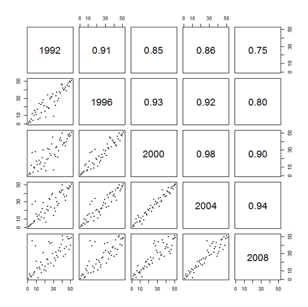
This figure compares the rankings of the states between 1992 and 2008. In the panels with the scatter plots, we can see the rankings in one year compared with the rankings in another year. For example, in the last row and first column of the table, the rankings from 1992 are compared against the rankings from 2008. The upper panels of the figure display the correlation (technically the Spearman’s rank correlation coefficient), which is just a numerical summary of the relationship between the two years. This statistic ranges between -1 (an exact reversal of the rankings) and +1 (an exact replication of the rankings from one year to another).
If history is any guide (and the plot above seems to suggest it is an increasingly good guide), the rankings of the states in 2012 will closely resemble the rankings in 2008.
A Return to Normalcy (?)
It has not always been this way. If we look back to a particularly strange time in American politics (the immediate post-WWII years), the story was much different. The figure below reproduces the earlier one for the elections between 1948 and 1964.
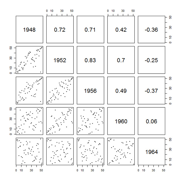
There was relatively high continuity between 1948 and 1956 (although never as high as in recent elections), but the 1960 and 1964 elections bear almost no relation to one another. While knowing the lineup of the states in 1992 would give you a considerable amount of information about the 2008 rankings, the 1948 and 1964 elections are actually negatively related to one another.
We can back the clock up even further to see just how strange these post-war elections were. The figure below shows the relationship between the elections between 1872 and 1888.
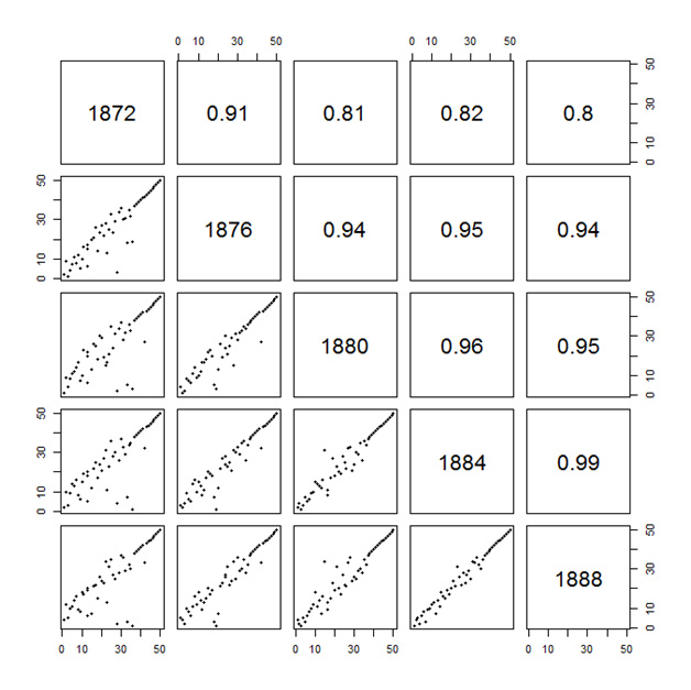
Here again, we see remarkable consistency from one election to the next.
The South
The breakup of the “Solid South” ranks as one of the most dramatic changes in all of American political history. For nearly a century following the Civil War, the Democratic Party was the only game in town in the Southern states. This was made possible by the strong animus against the Republican Party among Southern whites and institutionalized racism (in the form of literacy tests, poll taxes, grandfather clauses and other “Jim Crow” laws) that prevented African Americans from exercising their right to vote. The ancien régime started to show some cracks in 1948 (when the national Democratic Party adopted a civil rights plank at the urging of its Northern, liberal wing), and the whole system was in serious danger by 1964 (when President Johnson signed the Civil Rights Act into law).
Perhaps the aberration in the post-WWII years is driven by these dramatic changes in the South. Yet, if we separate out the Southern and non-Southern states, we can see that the story is not much different.
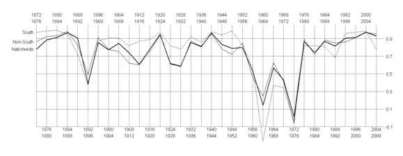
The figure below abstracts a little further from the vote returns. Here we are looking at the correlation between one election and the next. The lines show how the relationship between an election and the one immediately preceding it changes over time for the non-Southern states (solid line) and the Southern states separately (dashed line). The chart begins by comparing the results of the 1872 election with the results from the 1876 election. They are highly correlated. This high correlation continues for (with one hiccup in 1896) until we reach the 1950s. There is a quite abrupt return to normalcy (high year-to-year correlations) in the late 1970s. Throughout all of this, the South does not behave markedly different from the rest of the country.
Presidential campaigns as national politics
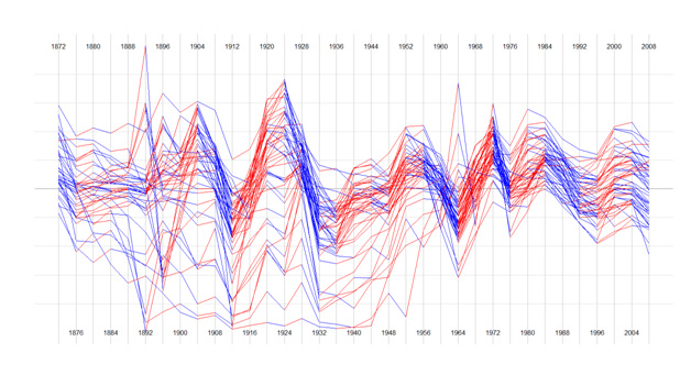
This final chart shows the proportion of the two-party vote that went to the Republican candidate over the period from 1872 to 2008. Each state is represented by a line. They are connected from year to year to show the overall pattern. When the vote for the Republican candidate increased between one year and another (as it did, for example, between 1876 and 1880 for most states), the line is shown in red. If it decreased, it is shown in blue (as it did for most states between 1872 and 1876).
Barring some dramatic and quite unforeseen transformation of American politics, the 2012 election will look much like the 2008 election (at least in terms of the relative positioning of the states). That is (most emphatically) not to say that the result itself is foreordained.
One way of reading these results is to conclude that politics has become increasingly nationalized as it has polarized. This nationalization would explain the stable rankings and uniform shifts that have characterized recent elections. The shifts in election results are not concentrated among the handful of states that receive endless barrages of campaign advertising. Rather, all of the states have tended to move toward the candidate who ultimately wins the election. In 2008, this meant that a state as deeply into the Republican column as Utah shifted toward Obama about as far as the 2008 "battleground" state of Colorado which moved about much as heavily Democratic Vermont.